Project at a glance
Hallwood Enterprises, established in 1979, needed an updated identity that could carry its history into a more consistent set of business and marketing materials.
Client: Hallwood Enterprises
My role: Brand strategy, identity refresh, and collateral design
Scope: Mission, vision, and brand story; refreshed logo suite; colors and typography; a supporting pattern; flyers; presentation slides; printable and digitally fillable forms; business cards; and email signatures
Refreshing a familiar identity
The challenge was to modernize Hallwood’s branding while keeping recognizable elements of its existing identity. Conversations about the company’s values informed updated mission and vision statements and the brand story.
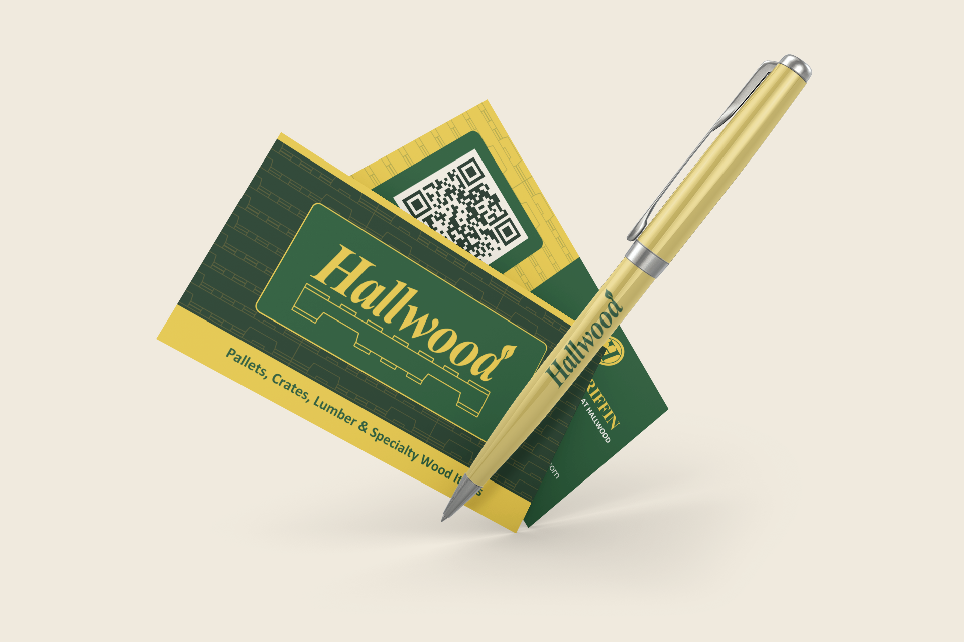
The logo refresh retained the Hallwood name, added a leaf to the D, and updated the pallet illustration beneath the wordmark. A coordinated suite of logo variations provided options for different formats.
Turning the identity into practical materials
An updated color palette, selected fonts, and a pattern based on the pallet illustration connected the individual pieces. The system was applied to flyers, PowerPoint slides, printable and digitally fillable forms, business cards, and email signatures.
The intended result was a recognizable, consistent identity that respected Hallwood’s history and gave the team coordinated materials to use in everyday communication.
Explore the project
The original work below includes identity applications and materials marked Before for comparison.







Refresh your brand and the materials behind it
Explore brand identity and logo design, then share your project goals to discuss a refresh or a broader identity project. You can also contact me with a question.