
Branding Beyond Logos: Essential Brand Assets Every Small Business Needs
Think your logo is your brand? Not quite.
It’s one of the most common misconceptions I see, especially among small business owners who are just getting started. You’ve invested in a great-looking logo, maybe picked out a few brand colors, and called it a day—only to realize later that something still feels off when you look at your website, social media, or marketing materials. That disconnect? It’s because a logo alone isn’t enough to carry your brand.
According to a survey by Lucidpress, businesses that maintain consistent branding across all platforms see an average revenue increase of 23%. Yet, so many small businesses miss the mark because they haven’t built out a full visual identity—they’re relying on just a logo and hoping for the best.
Here’s the truth: your brand’s visuals are like a language. They help you communicate your vibe, values, and professionalism before you ever say a word. When all the pieces work together, your brand becomes instantly recognizable and trustworthy—whether someone’s scrolling your Instagram, opening your email newsletter, or visiting your website.
In this post, I’m breaking down the essential visual brand assets every small business needs (beyond just your logo) to show up polished and professional at every touchpoint. We’ll cover everything from style guides to social media kits, marketing collateral, website visuals, and more—so you can build a brand that truly represents your business.
Why a Strong Visual Brand Matters
So what exactly is a visual brand identity? Simply put, it’s the complete visual system that represents your business—everything from your logos, color palette, and fonts to the imagery, templates, and graphics you use across platforms. It’s the reason a brand like Starbucks feels instantly familiar whether you’re holding a cup of coffee, scrolling their Instagram, or walking past a store.
I’ve worked with dozens of small business owners who came to me saying, “I don’t get it—my brand looks okay, but it doesn’t feel put together.” Nine times out of ten, it’s because they had a logo… and nothing else tying the rest of their visuals together.
Here’s why a strong visual brand matters so much:
Consistency = Trust.
When your brand looks the same across all your platforms, people trust it more. They know they’re in the right place and feel confident working with you.
Recognition = Top-of-Mind.
A full visual identity makes your brand sticky. The more consistently someone sees your colors, fonts, and layouts, the faster your brand will stand out from the crowd.
Professionalism = Higher Perceived Value.
It’s no secret: people judge books by their covers. If your visuals look polished and intentional, you’re instantly perceived as more professional—and people are willing to pay more for that level of quality.
For example, one of my clients—a wellness brand—came to me after realizing their brand visuals were all over the place. After refining their color palette, creating templates for social media, and refreshing their website visuals, they saw a 30% boost in engagement within just a few weeks. Their community responded immediately to the new, cohesive look because it finally felt right.
The good news? You don’t need a huge budget or a big team to create a strong, unified brand. You just need the right assets in place—and that’s exactly what we’re diving into next.
Asset #1: Brand Style Guide
Your brand style guide is the foundation of your visual identity—it’s the roadmap that keeps everything aligned, no matter where or how your brand shows up. Think of it as the rulebook for your brand’s look and feel: it tells you (and your team) exactly how to use your logos, colors, fonts, and other visuals in a way that’s cohesive and intentional.
Why is it so important? Without a style guide, your branding can get messy fast. One day your logo’s blue, the next it’s kind of greenish. Your fonts switch up from the default Instagram font to a cursive font, and suddenly, your brand starts to look...off. A style guide keeps everything buttoned up, even when different people are creating content or when you hire a designer down the line.
A solid brand style guide should include:
Your full color palette (with HEX, RGB, and CMYK codes).
Font families and guidelines for where/how to use them.
Logo variations (primary, secondary, tertiary) + clear rules for spacing and placement.
Do’s and don’ts: What’s off-limits? (e.g., don’t stretch the logo, don’t change the colors).
Optional: Brand voice/tone notes, iconography, and photography style.
The more detailed your style guide is, the easier it is to keep your brand consistent as you grow. I include a comprehensive style guide with every brand package I offer—because great branding isn’t just about the design, it’s about giving you the tools to keep it strong long after launch.
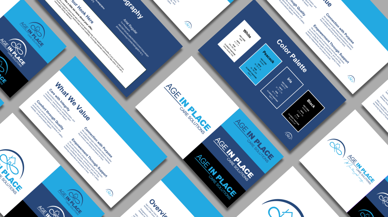
Brand Style Guide Example for Age In Place Care Solutions.
Asset #2: Social Media Branding
Your social media is often the first place someone encounters your brand—so those visuals? They need to be on point.
Social media branding includes everything from your:
Profile picture (usually your logo or a strong brand mark).
Cover images or banners (for platforms like Facebook, LinkedIn, and YouTube).
Highlight icons (for Instagram).
Story and post templates (so your feed stays cohesive & recognizable).
Why does this matter so much? Because in a fast-scrolling world, visual consistency = instant credibility. If your social presence looks polished and cohesive, people are more likely to follow, engage, and trust you right out of the gate.
For example, one of my clients—a local photographer—started using branded templates for her Instagram posts and Stories. Within a month, not only did her feed look way more professional, but her engagement also shot up because her audience recognized her posts instantly (even before seeing her name).
And don’t forget: each platform has its own sizing and format quirks. A banner that looks perfect on LinkedIn might get awkwardly cropped on Facebook or Twitter. That’s why it’s so important to have your visuals sized and optimized for each platform you use.
Not sure if your social visuals are up to par? I offer social media design packages and monthly social media management services to help you create a cohesive, on-brand presence that makes a strong first (and lasting) impression.

Social media templates with cohesive branding for Freeman Sound & MINDSET Concert Series
Asset #3: Branded Marketing Collateral
Marketing collateral is all the extra stuff that helps you make a memorable impression—both in person and online. These assets are what people physically hold, download, or engage with when interacting with your brand, and they’re essential for making your business look polished and professional at every touchpoint.
Your branded marketing collateral might include:
Business cards – Classic but still essential, especially for in-person networking.
Flyers & brochures – Great for local marketing, events, and sharing your services in detail.
Email signatures – A subtle but powerful way to reinforce your brand with every message you send.
Presentation slides – Perfect for webinars, workshops, or pitches (because yes, these should be branded too).
Why does this matter? Every single piece of collateral is a chance to reinforce your brand’s identity. Whether you're at a networking event handing out a business card, or emailing a new client with a polished signature, your materials should consistently reflect your professionalism and attention to detail.
For example, think about receiving a business card that’s mismatched from the brand’s website or Instagram vibe. It creates confusion—and can make a business feel less reliable. On the flip side, when your physical and digital assets match up seamlessly, it builds trust and leaves a lasting impression.
I love creating marketing collateral that helps small businesses show up like the pros they are. Want to elevate your branded materials? Let’s make sure every piece you hand out or send looks as good as the work you do.

Professional marketing collateral design sample for EmpowerMINT Wellness.
Asset #4: Website Visuals
Your website is your brand’s digital home—and just like any home, it should look and feel like you. Cohesive website visuals are what tie everything together and make your brand shine online.
Here’s what that includes:
Branded hero images – The first thing people see when they land on your site; these should be bold, clear, and 100% on-brand.
Custom icons – Help guide visitors through your site in a way that’s both beautiful and functional.
Button styles & calls to action (CTAs) – These seem small, but consistent button styles and branded CTAs can dramatically improve both aesthetics and conversion rates.
Why does this matter? Your website is often your biggest opportunity to make a strong impression and convert browsers into buyers. If your fonts, colors, and images are all over the place, visitors are more likely to click away—because inconsistency erodes trust.
I’ve seen it time and time again: small tweaks to visuals (like aligning your button styles and cleaning up your hero section) can have a huge impact on how professional and trustworthy your site feels.
If you’re piecing your website together from different templates or making edits on the fly, it’s easy to end up with mismatched fonts, clashing colors, and generic stock photos that dilute your brand. This is where professional design makes all the difference—creating a site that not only looks good but works to build trust and drive conversions.
Want a website that doesn’t just exist but actually impresses? I’d love to help you create visuals that make your online presence unforgettable.

Branded website hero section example for Harbor Home Design.
Asset #5: Email & Newsletter Templates
Email might feel a bit “old school,” but it’s still one of the most powerful ways to connect with your audience—and your brand visuals should shine there just as much as on your website or Instagram.
A well-branded email setup includes:
✉️ Header graphics – Set the tone right away with a branded banner or image at the top.
🔗 Branded footer/signature – Every email you send (even a simple update!) should reinforce your professionalism with a polished footer.
📐 Layout consistency – Fonts, button styles, spacing… it should all match your overall brand vibe, whether it’s a one-time promo or a regular newsletter.
If you’re using automations like welcome sequences, nurture funnels, or abandoned cart emails, your branding should stay just as strong there too. Branded templates help keep your automations looking polished and aligned, so your customer experience feels intentional at every step.
Why is this essential? Email is a direct line to your customers’ inboxes. It’s personal, high-converting, and one of the best ways to build long-term loyalty. But if your email design feels generic or disconnected from the rest of your brand, it chips away at your credibility.
For example: imagine subscribing to a brand that looks amazing on Instagram—then getting an email that feels like it came from a totally different business (or worse, looks like spam). It’s jarring—and often a dealbreaker. Chances are, you’ll unsubscribe almost immediately.
I work with platforms like Flodesk, Mailchimp, ConvertKit, and Constant Contact to create email templates that are not only beautiful but easy to update and reuse. Whether you’re sending out a weekly newsletter, setting up automations, or running a special promo, your emails should feel instantly recognizable and on-brand.
Need help getting your emails to match your polished look everywhere else? Let’s chat about creating templates that work for you or even having someone in your corner that can plan and send them out consistently so you can stay top of mind.

Email marketing template for Luminous Electric, designed by me at Rooks Advertising.
If You Want to Go the Extra Mile
Once your core brand assets are solid, there’s a whole world of next-level visuals that can help your business stand out even more. These extras aren’t essential for every business, but they can seriously elevate your brand’s presence when the timing is right.
Here are a few of my favorites:
Branded merch – T-shirts, mugs, tote bags… great for giveaways, events, or building brand loyalty.
Event signage – Banners, booths, backdrops—essential if you’re showing up at trade shows, markets, or conferences.
Social ads & video intros – Polished ad creatives and branded intros/outros take your content marketing up a notch.
Onboarding documents & contracts – Branded client-facing documents (like proposals, invoices, and contracts) keep your professionalism consistent all the way through the customer experience.
Digital business cards & link hubs – Easy-to-share, branded links (like a Linktree alternative or a sleek mobile business card) that make it simple for people to find your services, socials, and contact info all in one place.Not every business will need everything on this list—but if you’re scaling, launching something new, or investing in events or video marketing, these assets can help your brand look sharp and stay memorable.
Not every business will need everything on this list—but if you’re scaling, launching something new, or investing in events or video marketing, these assets can help your brand look sharp and stay memorable.
When your brand feels cohesive at every touchpoint—from your Instagram ads to your pop-up booth to your onboarding forms—it sends a powerful message: you take your business seriously, and your clients can trust you to do the same for them.
Curious which extras would make the most sense for your business? I’m always happy to help you figure out what’s worth investing in based on your goals.

Uniform and merchandise design for Northstar Electric.
How to Prioritize Your Brand Assets (Especially If You’re Just Starting Out)
If you’re feeling a little overwhelmed thinking about all the brand assets out there—don’t worry, you’re not alone! The good news is, you don’t have to tackle everything at once. The key is to start with the essentials and build from there.
Budget-friendly starting point
If you’re just getting started (or working with a limited budget), focus on:
A professional logo – Your core identifier.
A brand style guide – So your look stays cohesive as you grow.
A social media kit – Because social platforms are likely your first touchpoints with new clients.
This combo gives you the bare minimum foundation to show up polished and professional across key platforms.
When to invest in more
As your business grows, keep an eye out for signs it’s time to uplevel your brand assets, like:
Launching a new service or product.
Growing your team (more people = more need for brand consistency).
Participating in events, trade shows, or pop-ups.
Investing in new marketing strategies (like ads or email campaigns).
The goal? Build your brand intentionally over time, so that every piece feels like a natural extension of your core identity.
It’s always better to have fewer assets that are rock-solid and cohesive than to throw a bunch of scattered visuals out there. In branding, consistency > quantity, every single time.
Set Your Brand Up for Success
To sum it up: your brand is so much more than just a logo. A strong visual identity is built through a system of carefully crafted assets that work together—whether someone’s seeing your business card, scrolling your Instagram, browsing your website, or opening your email.
When your brand looks consistent, polished, and intentional across every touchpoint, it builds trust, authority, and real connection with your audience. And that’s what sets you apart in a crowded market.
Need help building a brand that goes beyond the basics? Let’s chat about creating a visual identity that works everywhere you show up.


Frequently Asked Questions
-
A visual brand identity is the complete system of visuals that represent your business—logos, colors, fonts, icons, imagery, and more. It helps you look polished and cohesive across every platform, building trust and recognition with your audience.
-
Yes! A logo is just one part of your brand. Without a full visual system (like a style guide, social media kit, and marketing collateral), your brand can look inconsistent, which hurts trust and professionalism.
-
A good style guide outlines your logo variations, color palette (with exact codes), font pairings, spacing rules, dos & don’ts, and sometimes even photography and icon styles. It’s like a playbook for your brand’s look.
-
Social media branding focuses on the visuals that make your brand instantly recognizable—like profile photos, highlight covers, post templates, and banners—while content creation is about the ongoing posts and captions you share.
-
Great question! Start with the essentials: a professional logo, a brand style guide, and a social media kit. These give you a solid foundation to look polished from day one.
-
It depends! If your business evolves (new services, audience shifts, or rebranding), it's a good time to refresh your assets. Otherwise, even though it’s typically recommended to refresh every 3-7 years, keeping your visuals consistent is more important than constant updates.
-
Even if you’re mostly digital, things like business cards, email signatures, and branded PDFs still matter. Every touchpoint—digital or physical—should reinforce your brand’s professionalism.
-
All kinds! Whether you’re a service provider, e-commerce brand, or local business, branded emails make you look more professional and help build trust with your audience over time.
-
I work with Flodesk, Mailchimp, ConvertKit, Constant Contact, and other popular platforms. I make sure your templates are easy to edit and stay on-brand, no matter the platform.
-
Branded templates are reusable designs you can update yourself (like Instagram post templates). Custom graphics are one-off designs made for a specific campaign or purpose.
-
Yes—templates are a great starting point, but custom visuals (like branded hero images, icons, and CTAs) ensure your site truly reflects your brand and doesn’t look like a cookie-cutter template.
-
Absolutely! I offer branded merch, event signage, and collateral design to help your brand stand out at conferences, markets, and other in-person events.
-
It’s a sleek, mobile-friendly page (like a Linktree alternative) that houses your key links—services, social profiles, contact info—all in one easy-to-share spot. Great for bios and networking. I build it directly in your website so your customers are led in a direction that best benefits you.
-
Yes! I can provide quick training on how to use your brand assets properly, so your team stays consistent across all platforms and materials.
-
Easy! You can request a brand audit to see where your current visuals stand—and we’ll make a plan to create the assets you need to elevate your brand.